BrightList is an application that gives you the healthiest version of your grocery list.
Don’t change what you eat - improve how you shop.
The Problem:
For adults aged 20 and older, 68.8% are considered to be overweight or obese. The medical care costs of obesity in the united states were estimated to be $147 billion in 2008. The annual nationwide productive cost of obesity-related absenteeism range between $3.38 billion and $6.38 billion. Obesity is a serious concern because it is associated with poorer mental health outcomes, reduced quality of life, and the leading cause of death in the US.
The Process:
There are 5 stages to the UX design process. In the first stage, empathize, we seek to gain an empathic understanding of the user and the problem they are trying to solve. In the next stage, we define the users needs, wants, use-cases, pain points, possible constraints and assumptions we are making as designers.
Once we define the problem, we begin to brainstorm and ideate possible solutions. After diverging on many ideas, we converge toward a few options that we could quickly prototype and test using several different techniques to determine our next steps.
Empathize
In order to better understand how people shop for food, my partner and I hit the streets and started talking with people. We asked them where they bought their food, if they considered themselves healthy eaters, and what they wished the shopping process was like.
We went to various grocery stores and observed how people shopped. What their flow was like, if they seemed to be in a rush; what they looked like, and what was in their cart. We spoke with a few people outside of the store and asked them what their experience was like. We also surveyed our friends via social media to find out why eating healthy was hard and what their shopping habits were.
Define
After surveying a variety of different people, we were able to better define the problem: Eating healthy was not only time-consuming but expensive as well. Obesity can develop at various points in a human’s life but most of the people we spoke with were college-age students so we decided to focus on that group.
Currently, the way people shop for groceries is quite antiquated. We make a list and we go to the store. We buy what we need and also what seems to be delicious in the moment. There isn’t much science put into the process, unless you are an above average healthy eater.
A big problem we discovered was that users would get stuck in a rut of buying the same food over and over again. More often than not, these were the foods they had been eating since they were kids. Those unhealthy foods had essentially become habitual purchases. From this, we determined that a successful solution would make healthy grocery shopping effortless and no more expensive than what the user was currently spending.
Ideate
After defining the problem we had a brainstorming session. This is a crucial part of the ideation process and it was important that all ideas were considered and written down. We then made a user story map with sticky notes, combining all the things that users currently have in their process along with the solutions we had brainstormed.
From this process we then began to formulate what the solution’s information architecture should look like. We pulled in some classmates to help us do a card sort and group together the different pieces in a rational manner. From our card sort and user story we were then able to put pen to paper and start to ideate 10x10 lo-fi thumbnail solutions.
Prototype
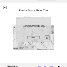
From the 10x10’s we were able to further drill down on solutions that made sense and start to prototype some lo-fi wireframes in Sketch. Taking these files and putting them into InVision we were then able to send them out to users to gather feedback on functionality.
It’s important during this stage that no colors or graphics are involved so that the user can focus on navigation and layout. We did a formal design review with our team and summarized all the changes that needed to be made. From this we made hi-fidelity prototypes and wireframes.
Test
With our High Fi- wireframes we were now able to perform some rigorous usability testing. This involved sitting down and watching the user walk through the Brightlist app and talk about what their impressions were. We gave the user’s tasks like ‘add a new item to your list’ and then observed how they got there. It was very important during this stage to not hint or help the user. In the final step, we made minor edits to the app’s appearance and feel.


